Washington Trails Association - Branding Redesign
TIME: Jan 2018 - March 2018 (3 months)
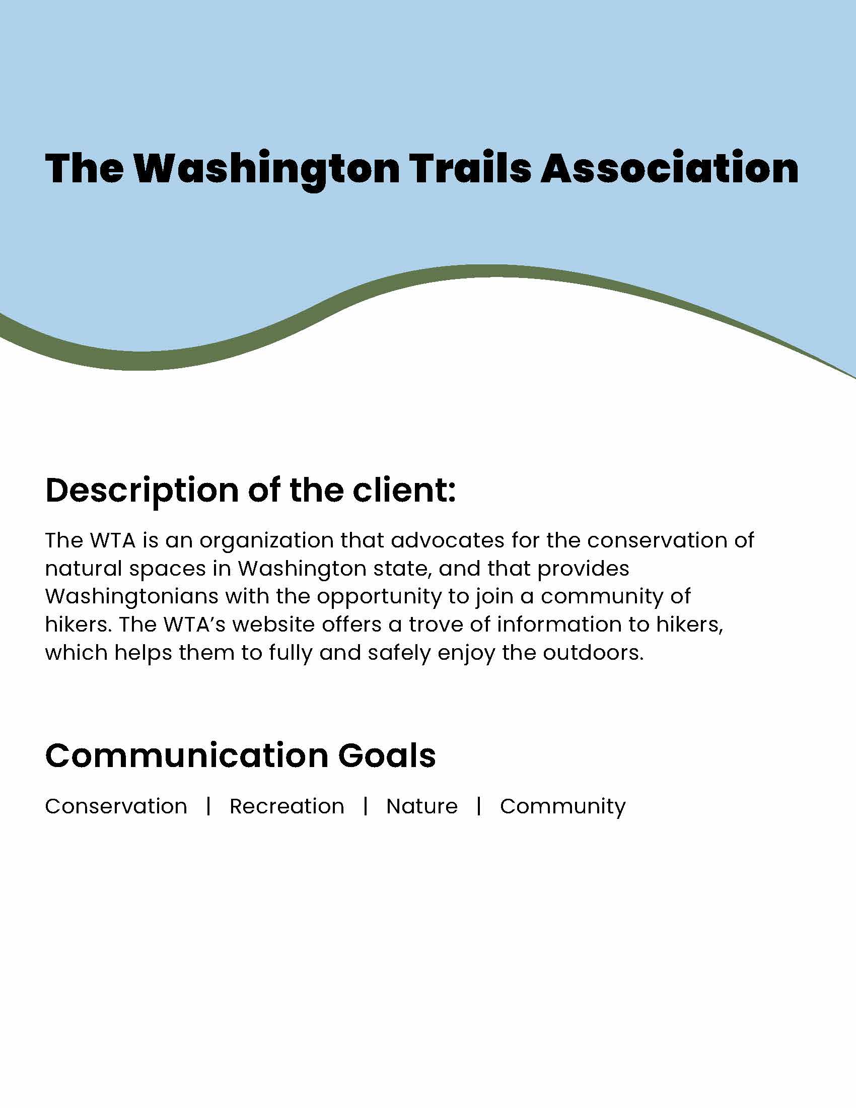
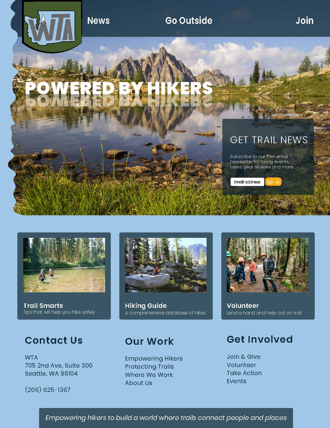
PROJECT: Web Branding Redesign. Washington Trails Association (WTA) is an organization that advocates for the conservation of natural spaces in Washington state, and that provides Washingtonians with the opportunity to join a community of hikers. The WTA’s website offers a trove of information to hikers, which helps them fully and safely enjoy the outdoors; this branding redesign encapsulates the vibrant energy of Washington’s outdoor spaces and the WTA.
TASKS: Redesign the WTA branding for the web. Embody the spirit of the WTA through redesign of logo, icons, typography, color scheme, and website landing page.
TOOLS: Adobe Illustrator, Photoshop
Redesign Process:
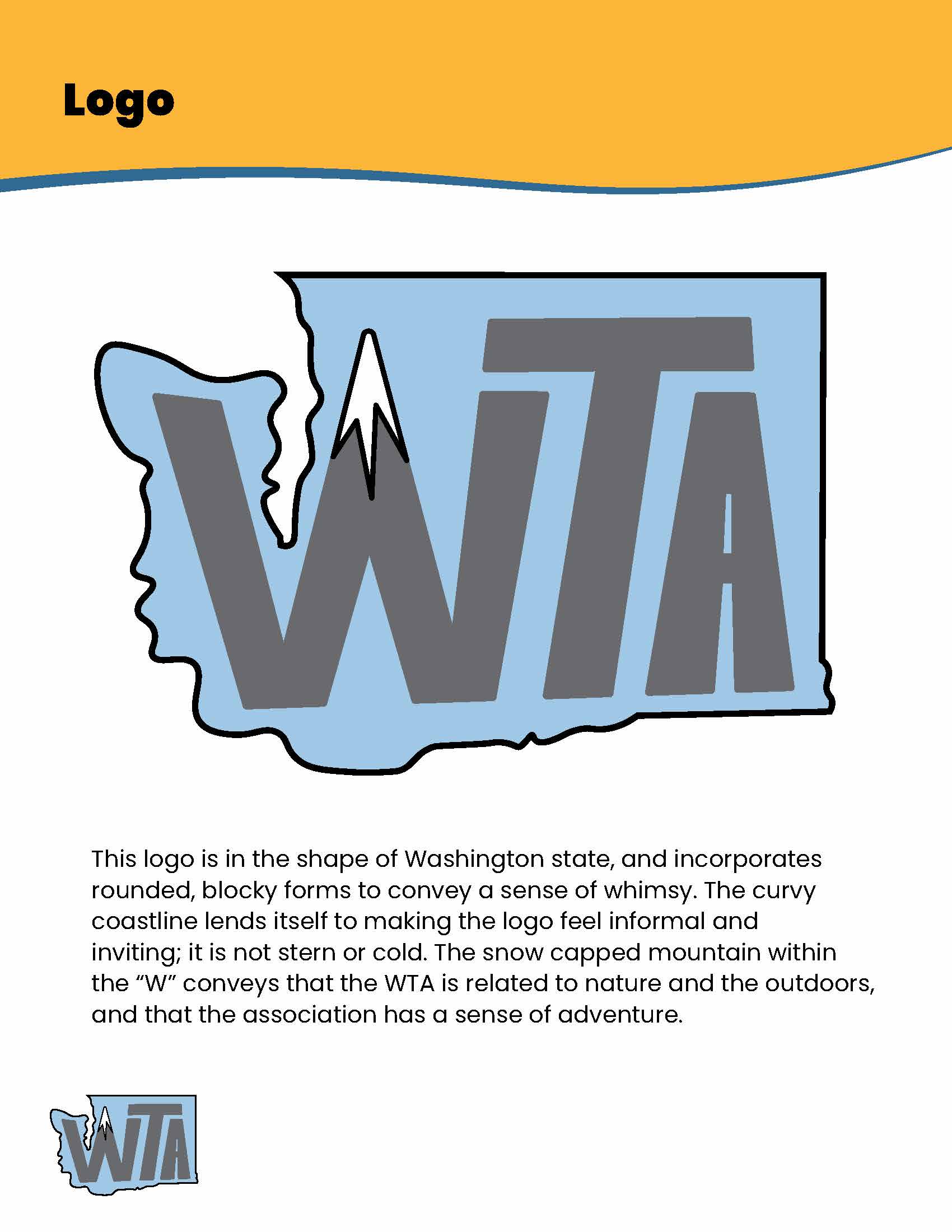
01. Logo
Empowering hikers to build a world where trails connect people and places
-WTA motto

Brainstorming sketches
I wanted the logo to embody:
- the motto of the WTA
- a sense of whimsy and adventure (to me that is the important part of hiking)
- the beauty of Washington state
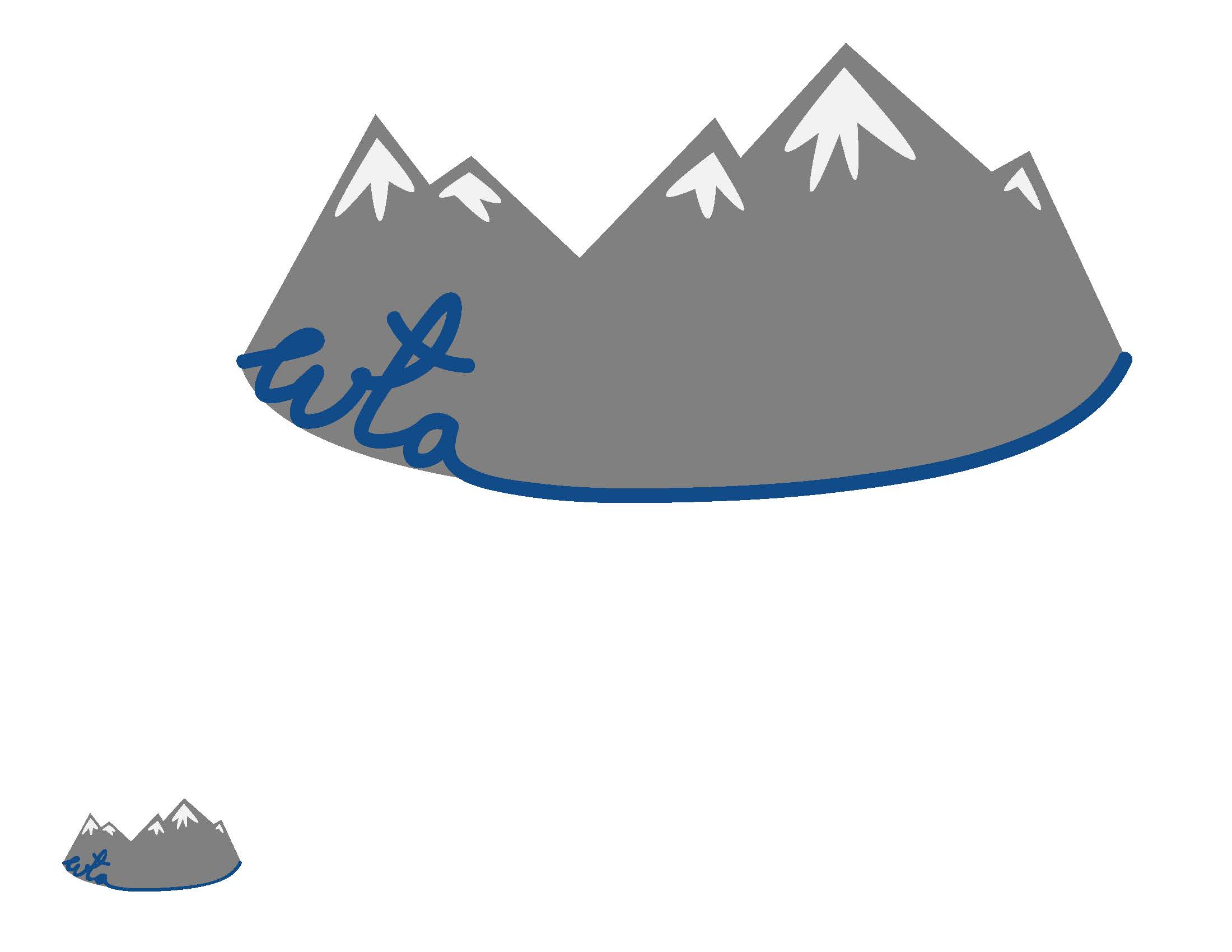
My three initial designs incorporated various aspects of hiking in Washington: mountains, hiking boots, and rivers. See them below.
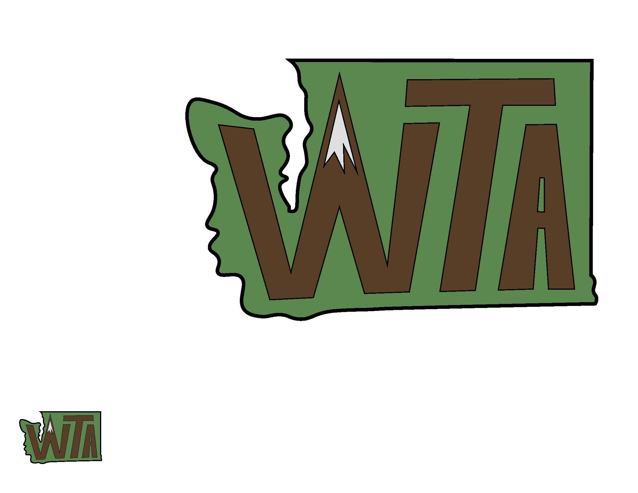
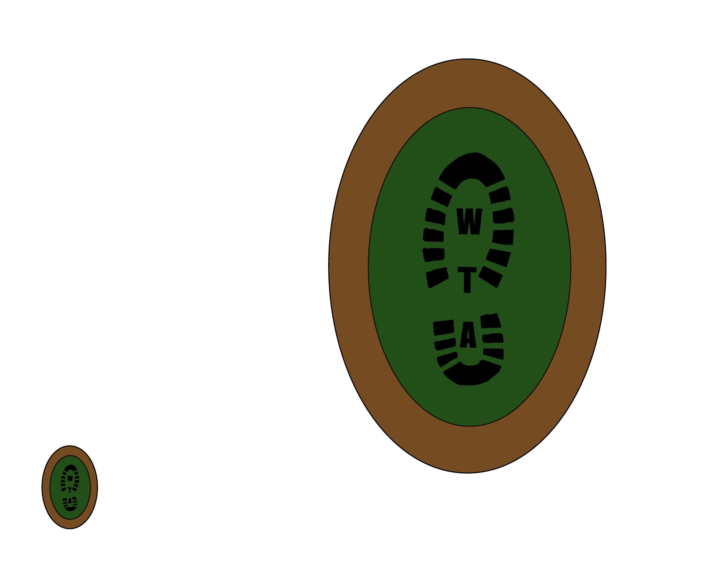

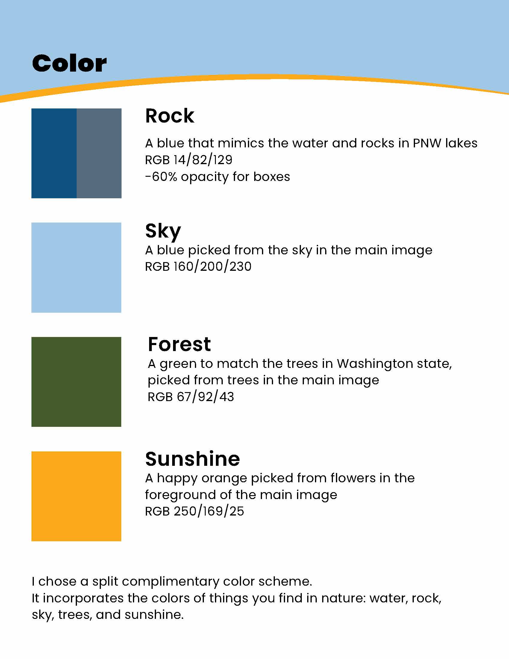
As I edited and iterated I realized the color scheme I had begun with, forrest green and brown, was both expected and overdone for an outdoors-related company.
So, for the logo I decided to switch to the colors of the mountains, which have striking peaks and points — like the angular parts of the logo.
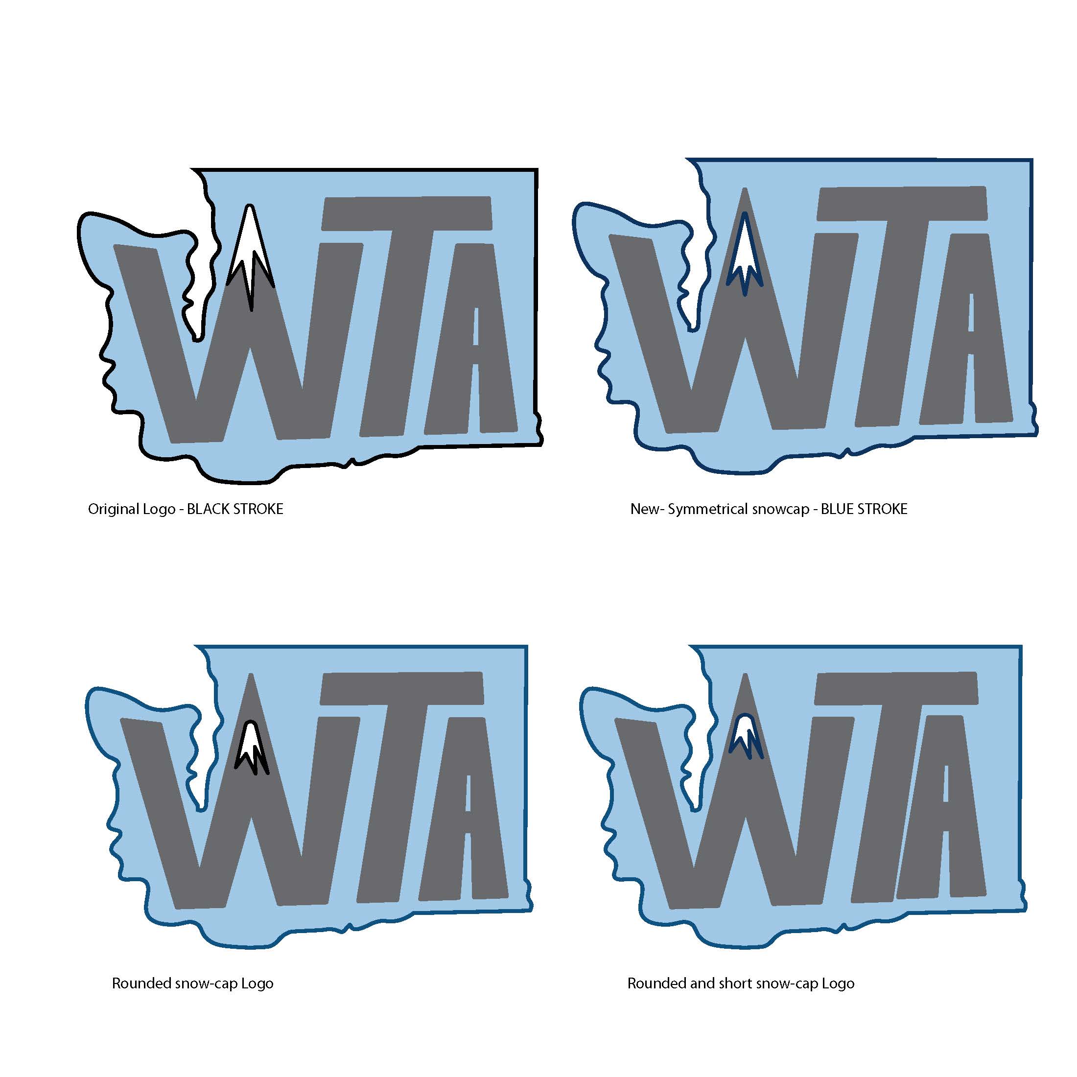
From there I played with color, stroke, and letter spacing as I further refined the logo.
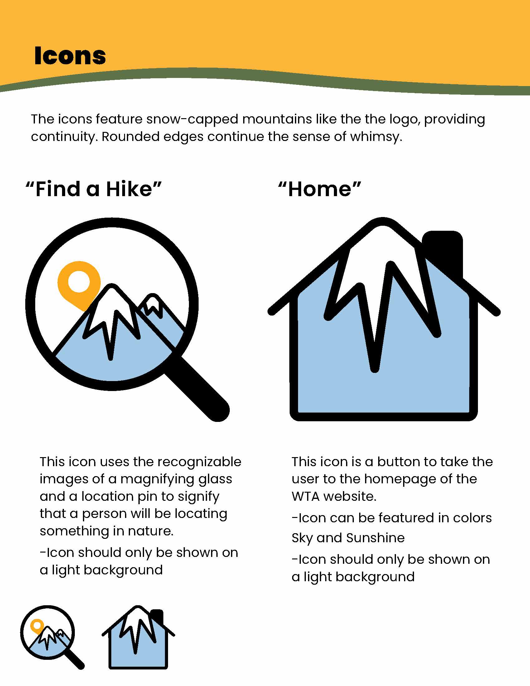
02. Icons
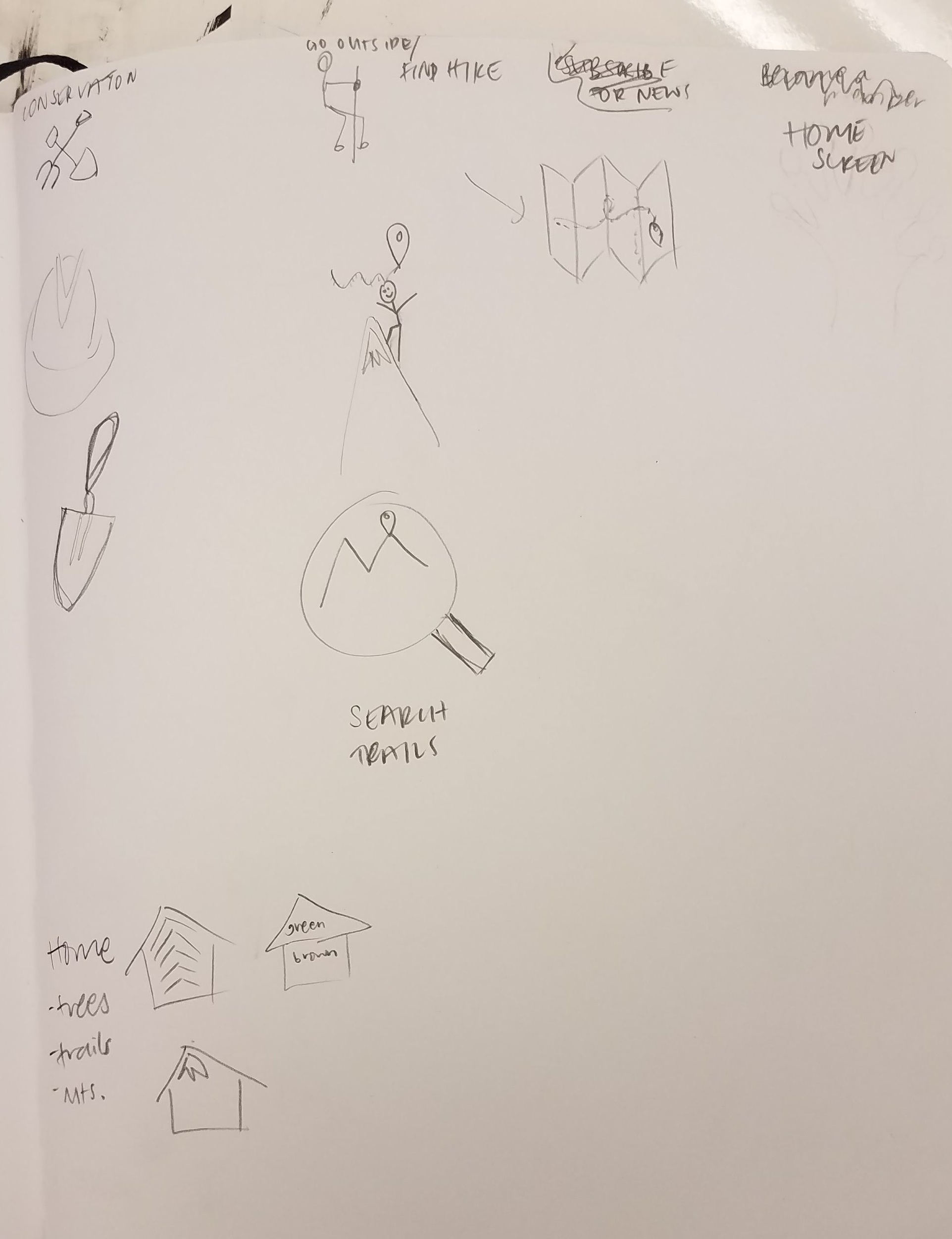
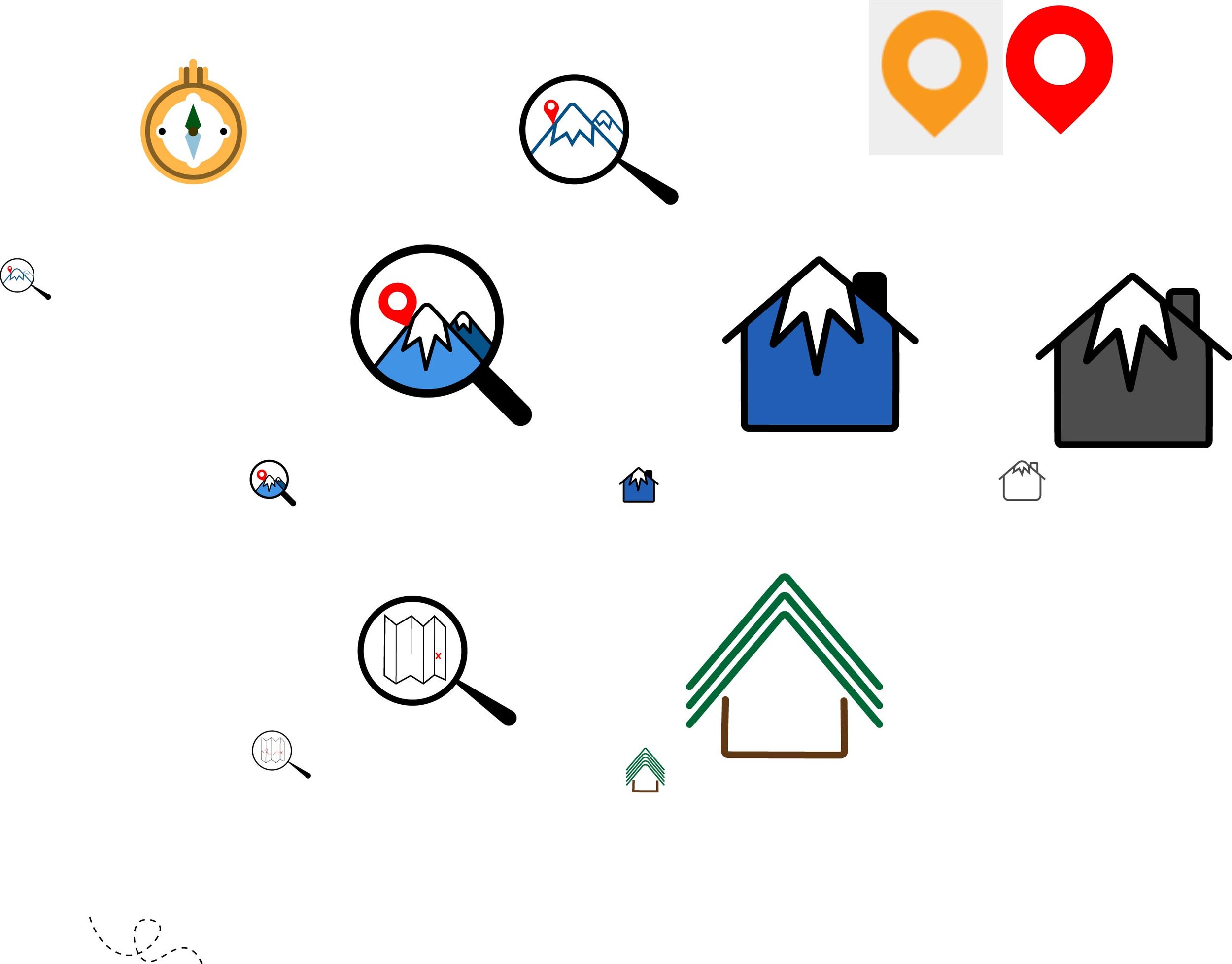

To the left are my initial design sketches and renderings.
I played around with the ideas of ‘finding oneself in nature’ and ‘a home in nature.’
Next, I refined my icons to be simple home and search buttons, while retaining their outdoorsy flair.
To iterate, I made the mountaintops asymmetrical to add visual interest, and to match the logo’s asymmetrical mountaintop.
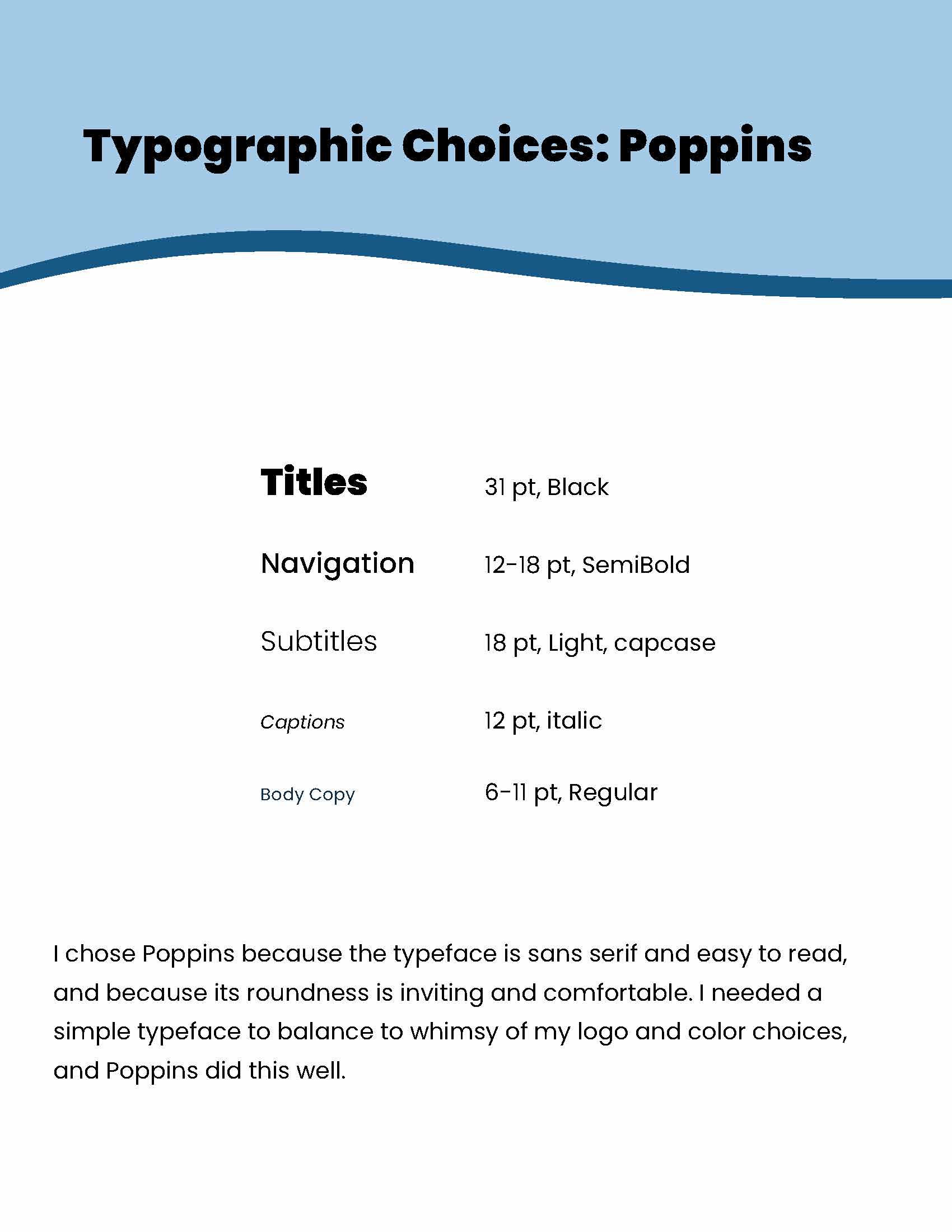
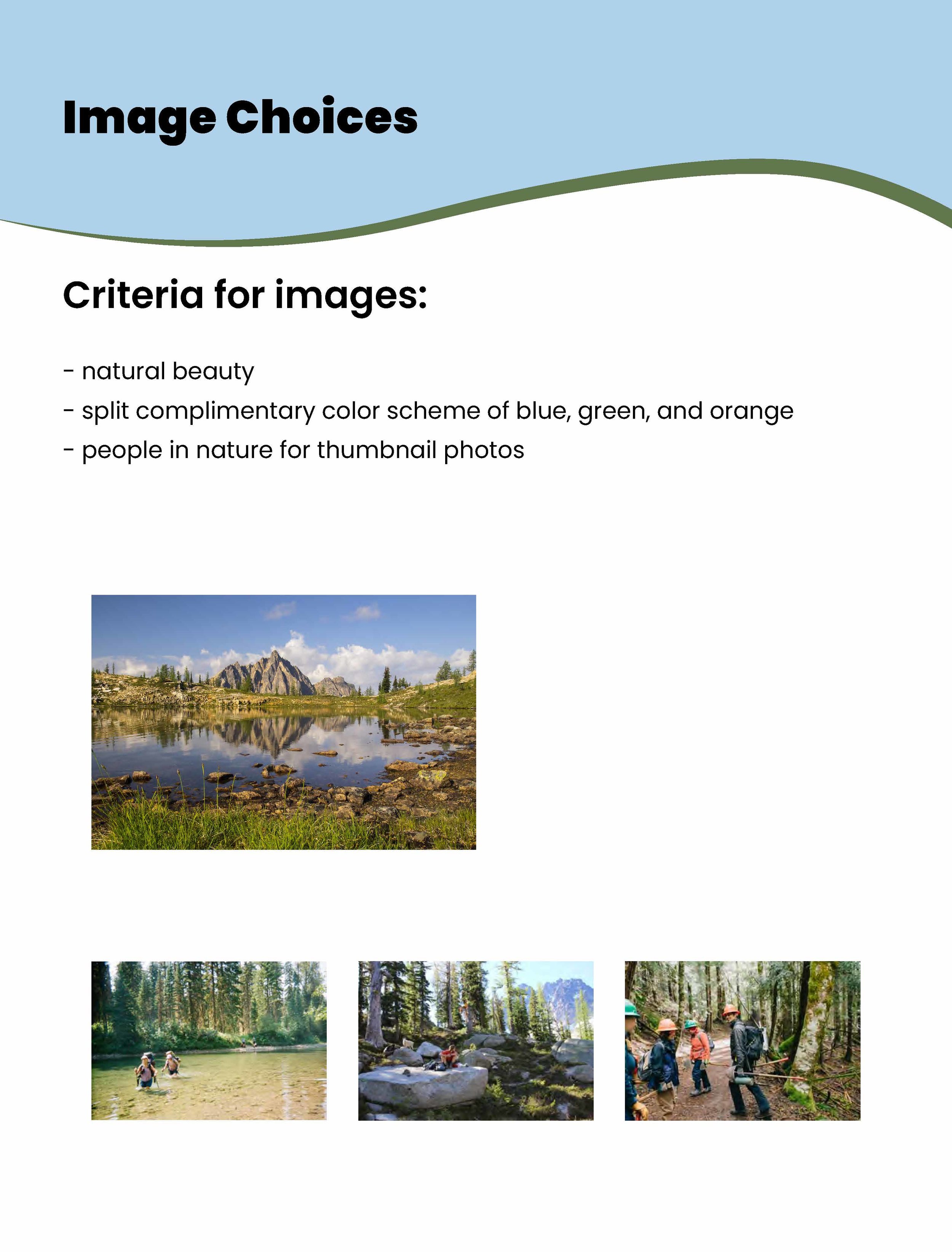
To create a cohesive visual system, I put together a brand book which explains my color choices, typographic choices, and image choices for the web landing page I designed.
03. Final Brand Book
Check out my final brand book below!